O-Music Player
from the bridgething app or this browser
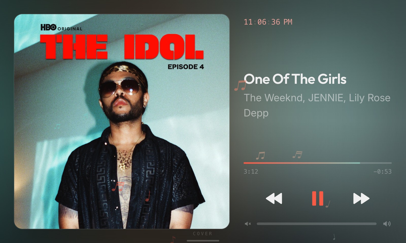
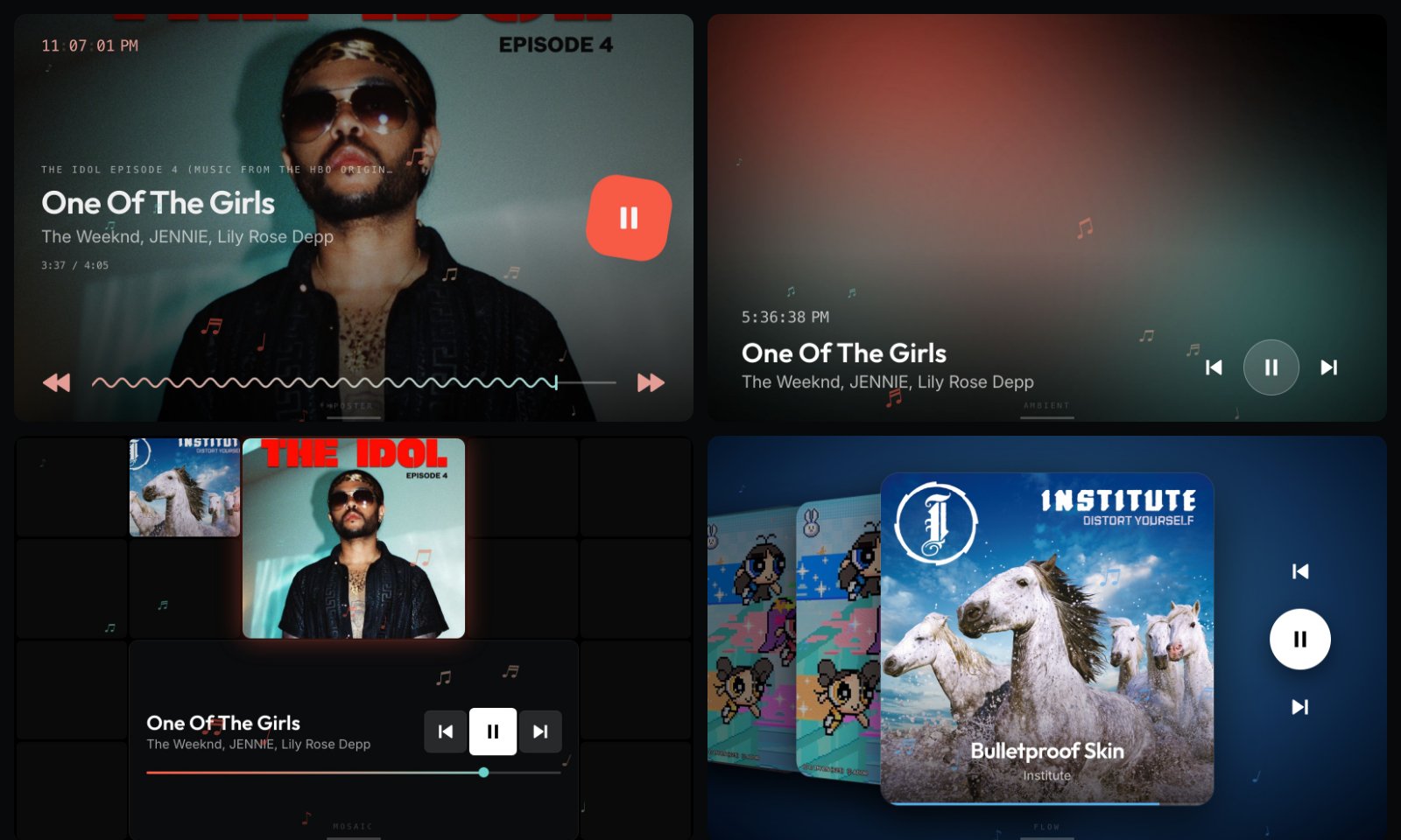
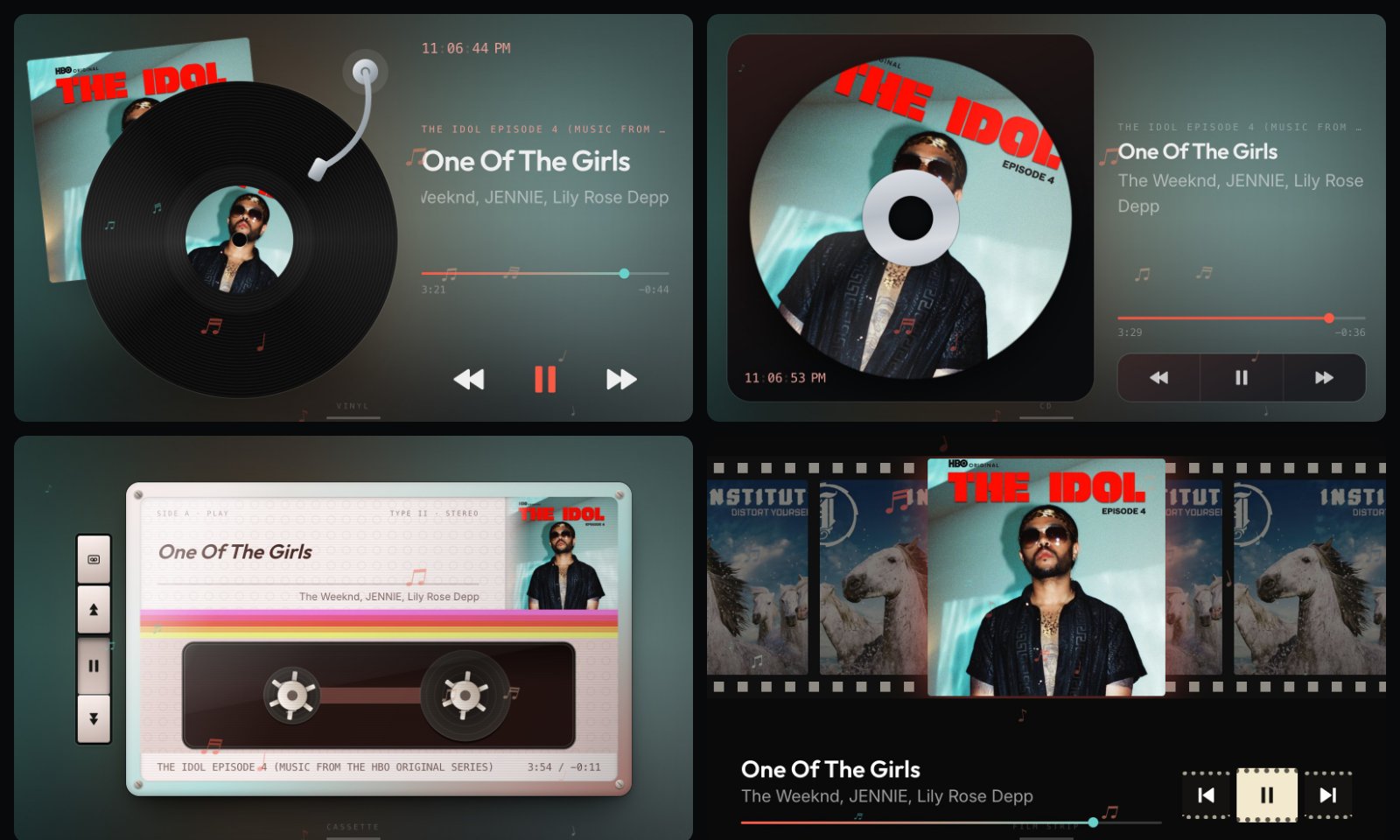
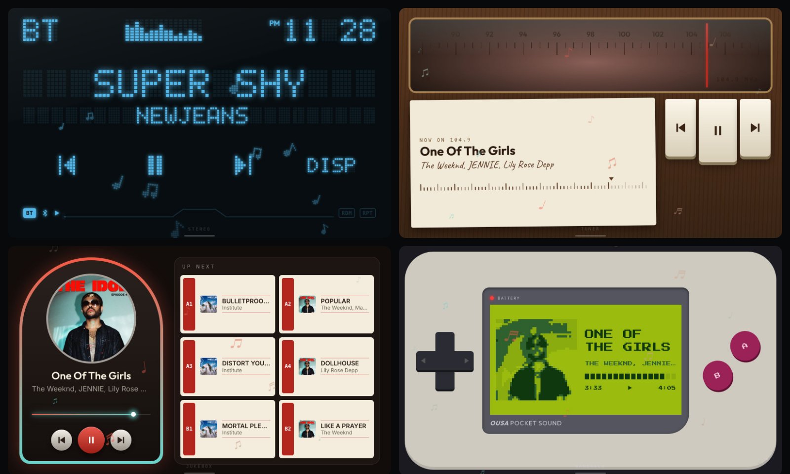
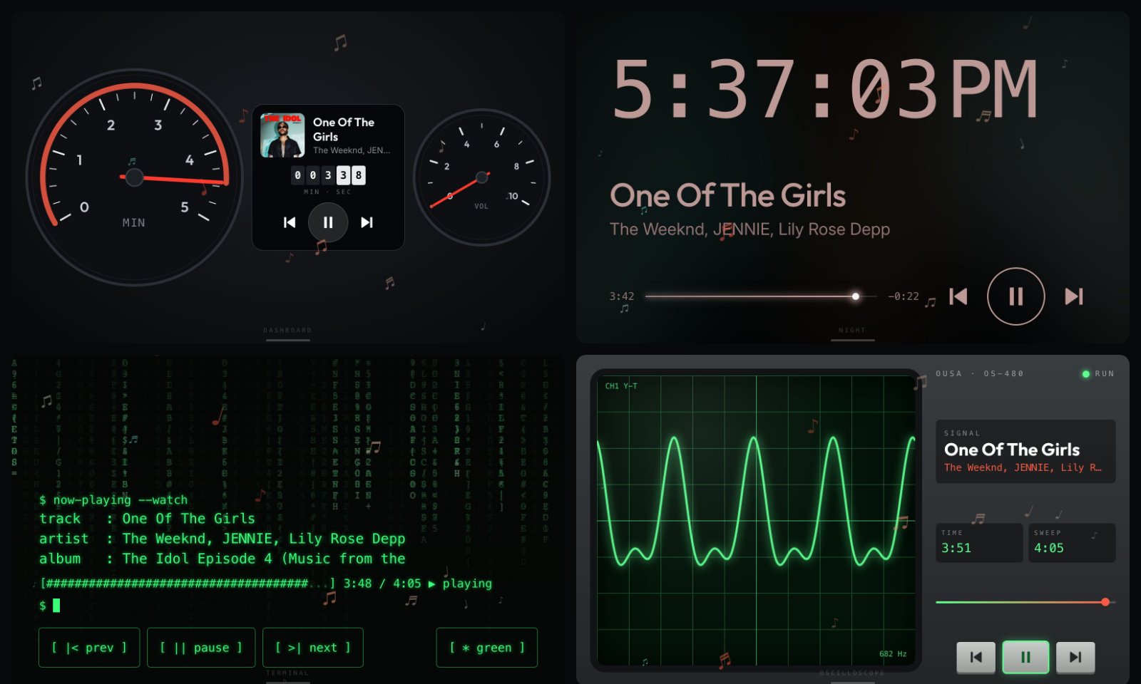
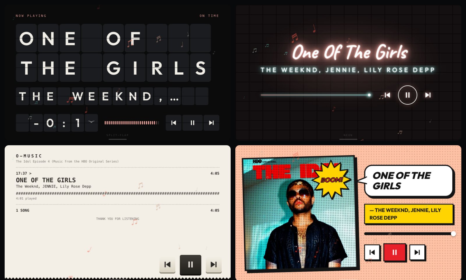
Now playing from your phone, in thirty-four styles coloured by the album art, and turnable to any mounting.
new in 0.51.1
The store listing now shows twenty-one of the player styles: Cover, then the artwork, records and tapes, devices, road and screens, and signs and paper styles, four to a screenshot.
permissions
- TCP tunnel
details
- id
- 01a07715-9963-72b3-9c4e-edcc6f6ebb6f
- needs
- libbridgething 0.12.1
- homepage
- https://github.com/ousachea/Ousa-Music-Player-v1
- source
- https://github.com/ousachea/Ousa-Music-Player-v1
versions
960.51.1lib 0.12.1 · 1.5 MB
0.51.0lib 0.12.1 · 1.5 MB
In the Cover style, tap the cover to run the art to the edge and back, and tap the track's side, away from the buttons and bars, to put the panel behind it on or off. A swipe across the art still changes the track. On an iPhone the queue showed nothing, or said nothing was lined up, because an iPhone shares where you are in the list but not the songs in it. It now says so, with the position, for example song 13 of 73, and the count of songs left. The library and the like button say plainly when they need Spotify linked in the bridgething app, rather than waiting on an answer that never comes or claiming a like that went nowhere. While a song is on screen with no phone connected, a small note at the top says so, for as long as the phone is away. Holding Mode to go back to the home screen no longer changes the style on the way out: Mode now moves to the next style when you let go of a short press. Settings, About ends with a reminder that holding Mode is the way home, and Help lists it too.
0.50.0lib 0.12.1 · 1.5 MB
Dim in the dark, under Display: the Car Thing's light sensor turns the screen down to a soft glow when the room goes dark, and back to your brightness when the light returns. Off unless you turn it on. Bigger touch targets: Cassette's deck keys, the Pocket's body colour dot and the Stereo's second display line were a little small to hit, in landscape and upright. Every button in every style is now at least 40 pixels across.
0.48.0lib 0.12.1 · 1.4 MB
Press the button under the wheel three times to turn the screen off. Any button, a turn of the wheel or a touch wakes it at the brightness it had, and that first press only wakes it. A double press now waits a moment before the on-screen buttons show or hide, so it can tell a triple press apart.
0.47.1lib 0.12.1 · 1.4 MB
A phone link that drops for a moment keeps the song on screen, paused, with a Reconnecting note, instead of flashing the empty screen. With no phone connected, the screen says so, the player asks the Car Thing to reconnect your paired phone on its own, and Reconnect now tries straight away.
91 older
0.47.0lib 0.12.1 · 1.4 MB
The Calendar and Karaoke styles are gone. If either was your style, the player opens in Cover. The styles are numbered and reordered so similar ones sit together: the artwork, records and tapes, devices, the road, words, screens, signs, then paper. Mode steps through them in the same order, the picker heads each group with its name, and the Style tab shows the number with the name.
0.46.2lib 0.12.1 · 1.4 MB
Picking a style closes the settings so you see it first; they open on its own settings next time, and a style with none no longer opens an empty page. The installed version sits under the About tab's name.
0.46.1lib 0.12.1 · 1.4 MB
The settings tiles keep their names clear of the tile's edge: Speedometer, Oscilloscope, Sheet music and the other long names no longer touch it.
0.46.0lib 0.12.1 · 1.4 MB
Nine new styles: • Speedometer: one big sports car dial, the needle sweeping the song's minutes to the red line. • Sheet music: the song as a score, its notes inked in as it plays. • Departures: an airport board, with what is queued on the phone as the later flights. When the phone shares no up next, as with autoplay, the board lists the songs that have already departed. The board's lamps and panel take the cover's colour, amber when there is none. • Handheld: an old pocket console's four shade green screen; the pad, A and B work the player. • Vaporwave: a striped sun, a running grid and a chrome title. • Oscilloscope: a green trace on a CRT; tap it for an X-Y circle. • Stamp: the cover as a postage stamp, cancelled with today's date. • Karaoke: the words filling with colour as they are sung, when the phone has them. • Calendar: the song as today's page on a tear-off calendar. A Button style setting under Controls draws previous, play and next as Round, Square, Outline, Glass, Pill or Minimal, each tile showing the look. Polaroid lies on a pile of prints in its other frames, in the order they come up; a tap shuffles the top print to the back like a card and the next one rises in its place. It also gains an Album frame in the cover's colour. About shows the installed version. Previous, play and next now look like part of their style: an engine start button in Speedometer, date tiles in Calendar, film frames in Film strip, a gold karaoke button, square blocks in Magazine, tiles in Mosaic, stamps and a wax seal in Stamp, stubs in Ticket, a shutter button in Polaroid, till keys in Receipt, and front panel keys in Oscilloscope. Film strip's frames and the lit cover in the gate are bigger, so the strip fills the height of the screen. A bigger icon: the ring and its note now fill the tile.
0.45.2lib 0.12.1 · 1.4 MB
New icon in the shared Ousa style: a glowing ring with a dot, in the app's own colour. Magazine leaves more room between the title and the seek bar.
0.45.1lib 0.12.1 · 1.4 MB
Icon shrunk under the device's 64 KiB limit so it shows in the launcher.
0.45.0lib 0.12.1 · 1.5 MB
Five more styles, twenty-seven in all: • Terminal: the song on a command line while code rains down the screen behind it, the way it does in The Matrix. The key in the bottom right trades the classic green for the cover's own colour (Text colour), and the keys carry text icons. • Ticket: the song as a concert ticket, the whole cover as its poster. Tap the stub to tear it off. • Film strip: what has played runs past as frames of film, the song playing now lit in the gate. • Comic: the cover as a halftone panel with the title in a speech bubble. Tap the artwork for another burst word, which also moves it to another corner. • Magazine: the song laid out as the front of a magazine. Terminal and Comic fill a portrait screen properly, and Magazine's cover lines now read on any cover.
0.44.1lib 0.12.1 · 1.5 MB
Mosaic shows each cover only once, and now moves: every few seconds a tile turns over to another cover, and the one in the middle slowly pushes in and back.
0.44.0lib 0.12.1 · 1.5 MB
Six more styles, twenty-two in all: • Dashboard: the song on a car's instrument cluster, the needle sweeping its length and a second gauge showing the volume. • Neon: the title in glowing tube on a brick wall, flickering on with each song. • Mosaic: a wall of recently played covers around the one playing now. • Ambient: only the album's colours, drifting and swirling. Tap to see the song and the buttons. • Tuner: an old FM dial with a moving needle, a station card and ivory preset keys. • Typewriter: each song typed onto the page as it starts. Ten seek bars: alongside the line and the wave there are now cells, dots, a neon glow, a hand-drawn line, a pill, a ruler, a heartbeat and stripes. Auto gives each style the one that suits it, and each tile in the settings shows what it looks like. Settings open where you left them, and tapping a style slides its own settings in over the grid. Night fills the screen with a bigger clock and bigger buttons, in a dim tint of the cover's colour. Split-flap grows its board to the title, Receipt runs the full width with its buttons at the bottom right, Pocket shows the whole title, and Jukebox shows recently played songs when nothing is queued. Split-flap and Jukebox get controls to match their look. Anything you can tap to change a style's look lights up for a moment every so often, and the Polaroid photo now changes its frame: white, black or cream. Spacing between the text, seek bar and buttons is roomier across the newer styles.
0.43.0lib 0.12.1 · 1.4 MB
Six new styles, sixteen in all: • Night: nothing bright, for driving after dark. A large dim clock, the track in grey. • Split-flap: the track flips in letter by letter on a departures board. • Receipt: each song printed on a till roll as it starts, with the time it came on. • Jukebox: the song under a lit arch, and the phone's queue as selector strips you can tap. • Polaroid: the cover as an instant photo with the title handwritten under it. • Pixel: the cover in big square pixels, with block lettering. Each has its own picture in the style grid, and Mode steps through all sixteen.
0.42.0lib 0.12.1 · 1.2 MB
Double-press the button under the wheel to show or hide the on-screen buttons. A single press still opens settings. Settings have icons: one beside each section, and a small picture of each style on its tile. Offer to hide the buttons now lives under Controls, and it and On-screen buttons each carry a line saying what they do.
0.41.0lib 0.12.1 · 1.2 MB
Khmer shows properly. The Car Thing has no Khmer font, so titles like ដូចមេ came out as empty boxes; the player now carries its own. Long titles show in full in Cover, CD, Flow and Poster. Instead of being cut off after a few lines, a long title shrinks until all of it fits; short titles look the same as before. HD album art now works for music playing in a browser tab, which sends no album name: the cover is found by the song instead, and only used when the song and artist match. Settings are tidier. On the device, sections run down the left (Style, Display, Controls, Clock, About) and the one you pick fills the screen. The style grid lives in Style, with that style's own settings under it. Settings that do nothing until another is turned on stay hidden until then, such as clock size with the clock off or seek step unless the wheel scrubs. The companion app groups the same way, shows only the current style's settings, keeps each setting's explanation behind its name, and saves changes as you make them.
0.40.0lib 0.12.1 · 1017 KB
Pocket comes in more colours: silver, black, blue, pink, green, red, gold, and Album, which takes the cover's own colour and changes with every track. A small dot in the corner of the screen shows the colour and steps to the next on a tap, and Body colour in the style's settings picks one directly. The wheel's markings take a dark shade of the body so they read on every colour.
0.39.0lib 0.12.1 · 1015 KB
CD is now a cartridge, like a MiniDisc: the disc in a shell with screws in its corners, a slider carrying the cover, and a black hub in the middle. The disc is pressed in the cover's own colours with a metallic sheen (gold for a cover with none) and turns while the track plays. The shell comes in White, frosted and clear, or Black, smoked; tap the hub to trade them, or choose under Look in the style's settings. Tap the cover on the slider to print it across the disc instead: the slider slides away and the shell takes the cover's colour. Tap the disc to bring the slider and the colours back, or choose under Disc. The clock now sits above the song.
0.38.5lib 0.12.1 · 1010 KB
The artwork view on Pocket shows on its screen, inside the bezel, rather than across the whole display, so the body and the wheel stay in view. A tap on the screen toggles it.
0.38.4lib 0.12.1 · 1010 KB
Tapping Pocket's screen shows just the artwork across the whole display, over a blur of itself, and stays up from song to song until another tap brings the player back.
0.38.3lib 0.12.1 · 1009 KB
Pocket's screen runs the full height of the display in landscape, with a larger cover and the wheel a little smaller beside it.
0.38.2lib 0.12.1 · 1009 KB
Tapping the level meter on Stereo steps through the display colours.
0.38.1lib 0.12.1 · 1009 KB
Tapping the clock on Stereo switches the display between light and dark.
0.38.0lib 0.12.1 · 1009 KB
A tenth player style, Pocket: a pocket music player held sideways, with the cover, track and progress on a small screen and a click wheel beside it. The wheel's sides are menu (the queue), previous, next and play/pause, its centre plays and pauses, and dragging round the ring turns the volume, which the screen shows while it changes. Body colour is silver or black, and turned upright the screen stands above the wheel. Stereo gains Light or dark: the glowing night display, a daylight one with crisp dark dots on pale glass, or Auto, light in the AM and dark in the PM by the phone's clock.
0.37.0lib 0.12.1 · 999 KB
A third vinyl layout, Picture disc: the cover pressed into the whole face of the record, run off the edge of the screen with the clear ring and the hole through its middle showing the blurred cover behind, like the other layouts. The title sits beside it under a centred clock, over the artist and album, with a row of ticks to scrub along and round previous, play and next buttons under them. While the song plays the ticks pulse like a level meter and the playhead glides with a soft halo. Turned upright, the disc hangs from the top of the screen. Tapping the middle of the record now steps through all three layouts.
0.36.0lib 0.12.1 · 995 KB
An eighth player style, Stereo: the dot matrix display of a car head unit across the whole screen. Everything on it is set in 5x7 cells with the unlit dots faintly showing, in the album's colour, or from Display colour one of ice, amber, red, green, white, or rainbow, which turns the whole display slowly through every colour. The source, a level meter and the clock run along the top, the title runs large and scrolls a character at a time when it is too long, and a smaller line under it shows the artist, album or time, stepped by tapping it or DISP. Previous, play and next are drawn in the same dots, the volume reads out on the display, and a frame along the bottom fills as the song plays. The floating notes turn to pixel art over it. A ninth style, Flow: cover flow, with the track's cover square in the middle, its title and artist over it and the progress along its bottom edge, and the queue fanned out either side, up next to the right and just played to the left, each cover turned in towards the middle. Tapping a cover on the right skips to it, and tapping the middle one plays and pauses. When nothing is queued up next, the on-screen buttons move off the cover into the empty right side as a column, with a large play button. The covers stand on a dark wash of the album's own colours, or on black, from Background. Artwork now loads when the player is served over plain http, as it is while developing on the device, where it had been failing for want of a secure context. The player styles in the settings are a grid of tiles now, five across, and they work like tabs: tapping one switches to it and opens a page with that style's own settings, and All styles or the button under the wheel goes back. The general settings stay on the first page. A setting with more than six choices lays them out as tiles under its name.
0.35.2lib 0.12.1 · 972 KB
New screenshots taken from the current build, one for every style, including Dial for the first time. Nothing about the player itself has changed.
0.35.1lib 0.12.1 · 972 KB
The Lyrics style keeps its plus and minus for the size of the words when the on-screen buttons are hidden. The presets still cover play and skip, but nothing else set the size from the screen. The on-screen buttons lead the settings now, in their own group at the top of the list on the device and first in the companion app, rather than a few screens down under Controls.
0.35.0lib 0.12.1 · 972 KB
A seventh player style, Dial: a jog wheel beside a card, both on a wash of the album's colour. The track runs round a black disc as a thick arc from twelve o'clock in that colour, over a ring of machined ticks with the grooves faint beneath and the cover turning in the middle as the label. Ten seconds either way sit beside it, drawn as a loop with a solid head and the number set inside it, turning for the direction it jumps while the number stays the right way up, and the elapsed time and the length read under the label. The card is that colour taken down to something white type sits on, rather than the accent at full strength, which lit half the screen. It stands off the screen: a light edge along its top, a shadow under it, and the words in a well cut into it, darker than the card with a shadow along the top lip and a catch of light along the bottom. They roll through that well, the sung line in the middle and larger, the rest fading out at the window's edges, the column sliding rather than stepping as the line changes and a long line set smaller rather than cut. The fade is on the window rather than the column, which was fading its own far ends where nobody could see them. With no words it shows the album, title and artist. Under it the track reads again with a round badge of the cover, and under that previous, a white play circle and next. Turned a quarter the wheel sits above the card instead of beside it. Vinyl gets two layouts rather than one, under Layout. Turntable is what it always was, the record on the platter with the sleeve behind it, except that the sleeve is now a button: touch it and the two trade places, the sleeve coming forward and growing while the record drops behind it. The same swap is In front in the settings, so it survives a restart either way. Sleeve is a copy half out of its cover: the artwork square and flat on one side, the record pulled out on the other with the paper label showing in the album's colour and the spindle hole through it. It takes the pressing colour like the other one. The label in the middle of the record switches between the two layouts: a tap pulls the record out of its sleeve, another puts it back on the platter. It used to turn the pressing colour on and off, which is now a settings choice alone, since the middle of a record is the obvious place to reach for and only one thing can live there.
0.34.1lib 0.12.1 · 966 KB
The keys that size the lyrics are easy to hit. They were 36px circles sitting over lines whose own hit area ran the full width of the screen, so a tap that missed a key seeked the song instead. The keys take a 48px target now, and the lines stop short of the screen at 84% of its width, which leaves the strip they sit in to them alone. The target is the only thing that grew: they are still bare glyphs, like everything else on this screen.
0.34.0lib 0.12.1 · 966 KB
The Lyrics style sets its words at whatever size suits the reader. A pair of keys down the left edge of the screen, plus and minus, take it from 70% to 160% in tens, and Text size in the Lyrics settings does the same. The rows grow with the type rather than the lines running into each other, since the height a line is laid out in is scaled by the same amount as the text in it.
0.33.1lib 0.12.1 · 965 KB
The app is called O-Music Player now, on the store card, on the device and in the tab it opens in. Nothing else about it changes: same id, same settings, same data, so an installed copy updates in place and simply reads O-Music Player afterwards.
0.33.0lib 0.12.1 · 965 KB
The preset bumps sit over whatever the player draws along their edge, rather than under it, which matters on the Lyrics screen where the progress line runs along the top. On that style they are drawn in plain white instead of the album's colour, so the hardware marker and the progress line are not the same colour lying on the same edge. The button that puts the words away keeps its corner. It sat in the middle of the left edge with the words off and in the top corner with them on, so it moved every time it was pressed. The line being sung fills with the album's colour as it is sung. The fill is a second copy of the line clipped by width, and it runs as one animation across what is left of the line rather than being nudged on every tick, so it moves evenly and lands on the end of the line as the next one takes over. The player's clock only moves four times a second, which is what made a per-tick fill step, and what left it short of the end when the line changed. A gradient clipped to the glyphs was tried first and would not paint at all on an inline box with a sized background. Lines step back from the one being sung in three grades rather than all sitting at one size and a distance-faded opacity: full, then about four fifths, then two thirds, then smaller again, with the opacity stepping with them. The first pass moved the size by six per cent a step, which read as no step at all. A lyric line is never truncated. A long one is set smaller instead, in four steps down to just over half size, so it reads whole rather than ending in an ellipsis; the widest line measured on the device came out 110px inside the space it has. Nothing on the Lyrics screen is outlined any more: no shadow under the words, the track or the time. They hold their contrast by weight and brightness instead, which is what the grading of the lines is for. A long title in the corner takes two lines instead of being cut off. The Lyrics screen lays its controls out again. The elapsed time against the length reads in the middle of the top edge, under the hairline that draws the progress, and the button that puts the words away takes the other end of that edge; both sit level with the track in its corner, so the top of the screen reads as one row rather than three things at three heights. The transport is one row along the bottom: previous and next at the ends and play and pause in the middle, where a thumb lands. Play is a bare glyph like the other two now, in the album's colour with nothing drawn behind it: a filled square rotating under a page of moving words was one thing too many on the screen. A track corner along the bottom is raised to clear that row.
0.32.0lib 0.12.1 · 964 KB
The phone's queue, pulled up from the bottom edge of the screen. It shows what is playing at the top, everything lined up after it, and the recently played under that, each with its own artwork. Touching a row skips to it, which is the only thing the daemon lets a webapp do to a queue that belongs to the phone. What has already been played reads back rather than acting as buttons: the phone refuses to play one of its own history uris on a webapp's say-so, whether asked plainly or queued and skipped into, so a row that cannot do anything does not pretend to. The wheel scrolls the list, a push back down or the Back button puts it away, and the sheet is read fresh each time it opens rather than held. A short bar sits at the bottom of the screen, above the style tag, to say the edge is worth pulling on. The Vinyl record's colour comes off and on with a touch on its label. The middle of a turning record is the one part of it you can put a finger on, so it carries the pressing: a tap takes the colour back to black and another returns the one that was on, Album or Marble, rather than a default. The spindle stops swallowing the tap that was meant for the label under it. The clear cassette's cover no longer lies on its side. The mechanism is drawn standing and turned a quarter into place, and the artwork was taking that turn with it; it is drawn in the landscape space instead, where the window lands. Its keys move to a column down the left of the tape in landscape, with previous and next turned a quarter to point along the bar. The Lyrics style stops reporting the progress on a dial. A ring with a time in the middle of it belonged to a different screen than a page of words. How far through the song is now runs along the top edge of the screen itself, a hairline the width of the display that fills as the track plays and dims while it is paused, with nothing drawn for it to sit in. The corner it left carries play and pause instead: a rounded square in the album's colour that turns while the track plays, the way the Poster style's does, with the elapsed time against the length under it. The swipe now reads in the layout the viewer is looking at rather than the one the screen is wired in. Every pointer is turned back through the screen rotation before it is measured, so the pull that opens the queue comes off whichever edge is the bottom for you, and the track swipe drops the special cases it used to carry for 90, 180 and 270.
0.31.0lib 0.12.1 · 958 KB
A sixth player style: Cassette. A tape in a deck, with the title written across a cream label, the rainbow band every tape wore, and a window showing the two spools. The spools are the progress bar. The left one empties as the song plays while the right one fills, and both turn with the music and hold where they are when you pause. The shell takes its tint from the album's colour, and three chunky keys under it work the transport. Turned a quarter the tape is sized by width rather than height so it keeps its shape. The whole tape is painted from the cover. The shell, the label, the plate the window sits in, the tape on the spools and the keys all take the album's colour, and the rainbow band fans out around the cover's own hue rather than mixing two of them, since a cover with one hue would otherwise give five bands of the same colour. Two more cassettes, Printed and Clear, and a key beside the transport that cycles the three. Where the written tape is a blank label somebody filled in, the printed one is a pressed release: the cover is the label, printed as a sticker with a paper edge, a sheen across it and half a degree of tilt, and pressed onto a shell of brushed metal anodised in the cover's hue and bolted at the corners with socket caps rather than slotted screws. The window is die-cut through it, with a tape counter reading across that window and a line riding the ticks at the playhead. The track is stamped on the moulded half below rather than over the picture, in bold caps with SIDE A and the artist under it, the album and the time under that, and the spindle holes along the very bottom. Clear is the tape itself, seen through its own shell: two spools of brown tape filling the face with the wind drawn as the turns it actually has, hubs in the album's colour wearing the crown of teeth a spindle grips, the guide assembly and its pressure pad showing through the plastic along the bottom, the cover sitting behind the square window between the spools where the tape path graduations otherwise are, COMPACT CASSETTE moulded into it, and a white label strip across the top carrying the track, TAPE TYPE: HIGH BIAS / CHROME, the artist, STEREO and the time. It is drawn standing and turned onto its side, so the mechanism keeps the proportions a tape actually has while the shell lies the way the other two do. Artwork on the label, on by default, prints the cover square on the right of the written label with the title and artist keeping the room to its left. It fades into the paper along its inside edge rather than sitting in a frame, so it reads as printed on the label instead of stuck to it. On the printed design the cover is the label itself, so nothing there depends on it. A new track brings a new tape. One of eight printed patterns is chosen by hashing the track, so the same song always comes back on the same tape and the next one arrives on another: faint under the writing and around the window on the written label, machined into the metal on the printed shell. The colours come off the cover more directly. The shell, the label, the plate around the window, the tape on the spools, the writing on the label and the keys are all built from the cover's own hue and saturation rather than mixed into a cream, so a warm album gives a warm tape and a cold one gives a cold tape, and the label's writing is the album's dark rather than black. It is moulded rather than drawn flat. Light rakes across the shell in one diagonal, the screws are turned and slotted, and the window is sunk into the label with a shadow down its inside and a highlight along the lip. The tape wound on a spool is a radial gradient ringed with the turns of the wind, and the hub is cream plastic with a bright arc riding round it, so a spool reads as a thing with a top and a bottom. A fine line texture sits over the label the way it sits over printed card, and the transport is a tape deck's rather than a phone's: light plastic caps with black glyphs, a bright bevel along the top and a shadow under the bottom, set in a dark recessed strip with a hairline between them, pressing into it when touched. The play key latches down while the track plays, with its lighting inverted so it reads as held rather than lit, and rises when you pause. The label is marked SIDE A and TYPE II like the tape it is copying. The tape is larger in landscape, taking the height the screen actually has rather than three quarters of it. A long title stays on the label: it was laid out as a -webkit-box flex item, which sizes to its longest line and ran off the edge instead of wrapping, so it is held to the label's width and drops a size again on very long titles. The Vinyl style can press its record in a colour. Record colour takes Black, which is what it has always been, Album, which presses it in the cover's own colour, and Marble, which swirls the cover's two colours through it. Both keep the lightness low so the grooves and the sheen still read: a coloured pressing is what the resin is, not a light shone on the disc. Mode, and 5 on a keyboard, cycles through it: Cover, Vinyl, CD, Cassette, Poster, Lyrics.
0.30.2lib 0.12.1 · 938 KB
The corner opposite the track now shows how far through the song is, a ring with the elapsed time in it, rather than a play button repeating what preset 2 already does. It still takes a tap for play and pause, so nothing is lost by the change. The top and bottom of the Lyrics screen no longer darken. A gradient laid over the screen dimmed the artwork along with the words; the words are masked instead, so they thin to nothing at the edges and what is behind them is left alone. The artwork, the track and the buttons in the corners keep their full strength.
0.30.1lib 0.12.1 · 938 KB
Clicking a lyric after reading ahead with the wheel lands on the line you clicked. It was seeking correctly and then parking the view however many lines the wheel had moved past it, so the line that lit up was not the one under your finger and it was not in the middle either. The app is called Music Player everywhere now. Its page title, its package and the heading on this file all still said weather, which is the app the scaffold was copied from.
0.30.0lib 0.12.1 · 937 KB
A fifth player style, Lyrics. The words to whatever is playing, with the line being sung held in the middle of the screen, lit in the album's colour, and the rest falling away above and below it. The column slides rather than the lines moving, and the top and bottom fade out so a line leaves the screen rather than stopping at it. The artwork and the track sit in a corner of your choosing, under Lyrics → Track corner: top or bottom, left or right. On the right the artwork leads and the track reads back towards it, so the pair stays anchored to its own corner. Play and pause take the other end of that same edge, drawn the way Poster draws it: only the rounded square turns, and the glyph stays upright on top of it. Previous and next take the far ends of the other edge, so the four sit one to a corner. All of it goes away with the on-screen buttons. Backdrop blur is a new setting, beside intensity and drift. Lower it to read the cover through the words, raise it for a wash of colour, take it to zero to leave the artwork sharp behind them. It applies wherever the backdrop draws, and its default is the blur the backdrop always had. Touching a line plays from it. Every line knows the moment it belongs to, which is exactly what a seek needs, so the words double as the scrubber. The wheel reads ahead rather than scrubbing: it moves the words a line a click while the song carries on, and the view goes back to the line being sung five seconds after you stop. It does this in Lyrics whatever the wheel is set to elsewhere. A button on the left of the screen puts the words away and brings them back, and Lyrics → Show the words does the same from the settings. It only appears when there are words to hide. With the words off, or with a track that has none, the style shows what is playing rather than an empty screen: artwork, title and artist down the middle, with the transport under them. The phone decides what there is to show. Timed lyrics get the moving column; lyrics with no timings are laid out as a page you can scroll with the wheel; a track with neither says so under its title rather than showing an empty screen.
0.28.0lib 0.12.1 · 928 KB
Cover wraps a long track onto as many rows as it needs, up to three, with two for the artist, rather than scrolling it past on one line. The column is deep in either orientation, and deeper still with the panel drawn, so there is room to grow into. Two settings for the Cover style. Panel behind the track puts the track and the controls on a tinted panel of their own instead of straight over the blurred artwork, which is the phone lock screen look. It fills the height it is given rather than shrinking to its contents, sits an even margin from the edges, and takes the album's colour the way the rest of the style does. It draws in both orientations. Off by default, since the style has been drawing without one. Volume slider turns Cover's slider off. The wheel still sets the volume, and with no slider on screen the reading the other styles throw over the middle comes back, since there is nothing left to watch instead.
0.27.3lib 0.12.1 · 928 KB
The CD style's transport bar sits on a dark ground of its own rather than straight on the blurred artwork. It takes the same wash of the album's colour the tray does, over a lighter base, so it belongs to the style without sinking to the tray's depth.
0.27.2lib 0.12.1 · 928 KB
Changing a track no longer flashes the background. The blurred artwork was being torn down and rebuilt on every change, leaving the screen bare while the new one decoded; it now stays where it is and the incoming art dissolves over the outgoing one, in every style. CD and Vinyl stop sliding the whole player at the same time as swapping the disc, which was two movements arguing. The player changes over on the spot and the record or disc does the moving, turning in from a little smaller and settling. A long title no longer runs off the right of the screen in the CD style. It stays inside its column, and rather than scrolling past it wraps onto as many rows as it needs, up to three, with two for the artist. The track is centred in the space the controls leave, which is deep enough to grow into.
0.27.1lib 0.12.1 · 927 KB
The style you are in is named in a small tag along the bottom of the screen, low enough to sit under the settings hint and quiet enough to ignore. Turned, with the on-screen buttons off, the Vinyl style gives the record the space they leave. The clock stops reserving a row height it does not need and the record grows from 52 to 56 percent of the screen, which is as large as it goes before it is wider than the column it sits in. With the buttons showing there is no spare height, so nothing moves.
0.27.0lib 0.12.1 · 926 KB
The settings on the device are reorganised around the style you are in. The style picker sits above the list rather than scrolling inside it, since it decides what the rest of the list holds. The album art block beside it is smaller and carries its size and whether the HD lookup is on, on one line. Everything that depends on the style is gathered under that style's name, marked only in this style, instead of being scattered through the groups and quietly vanishing when you switch. Poster, which has no settings of its own, simply has no such group. The clock's Position is hidden in the CD style, which pins its clock to the corner of the tray and so has no position to offer. It stays in the Clock group for the three styles that honour it, rather than moving in with the style's own settings, because it is a clock setting that one style happens not to use. A rail down the left edge shows how far the list runs and where you are in it, which the wheel could not tell you before.
0.26.1lib 0.12.1 · 925 KB
In landscape the CD style centres the track in the space above the controls rather than starting it at the top, which left it hanging under the clock with a gap beneath. A new track puts a new record on the platter and a new disc in the tray: in Vinyl and CD the disc drops in from slightly small and turned back, and settles. It arrives when you switch into the style too, and it follows the Animations setting. Turning the screen settles the preset markers into their new edge instead of stretching them into it. The bump runs along a different axis in each orientation, and animating that swap pulled it out of shape on the way; it now eases in once, quickly, and the bump's own fade is left alone.
0.26.0lib 0.12.1 · 925 KB
The preset markers are longer again, another third, and the bump now thins and dims as the glyph beside it fades. Once the glyph has gone the bump is the whole marker, so it stops being as loud as it was while it had a label to introduce. Tracks marked explicit now carry an E beside the artist. The phone sends no such flag, so it comes from the same search that fetches the artwork, asked about the track rather than the album: an explicit album can hold clean tracks and marking those would be worse than marking none. It needs HD album art switched on, since it is the same lookup and the same permission, and a track the search cannot confidently match is left unmarked rather than guessed at.
0.25.4lib 0.12.1 · 923 KB
Turning the wheel in the Cover style no longer throws the volume readout over the middle of the screen. Cover draws a slider of its own, which moves with the wheel, so the readout was saying the same thing twice and covering the player to do it. Every other style still shows it.
0.25.3lib 0.12.1 · 923 KB
Classic and Cover are one style now, called Cover. They were two takes on the same idea, art beside the track, and Cover had grown the better one. It keeps its own layout and gains what Classic owned: Art to the edge and Art pulse. With the art to the edge, the track and the controls hold an even margin of their own on every side rather than giving it up along with the artwork. Anything set to Classic moves to Cover on its own, since the two are no longer distinguishable. Four styles remain: Cover, Vinyl, CD and Poster. Skipping a track slides the new one in from the side it came from, in every style. The animation sits on the one element all five share, so it is the same movement whichever player you are using, and because that element is inside the turned stage the slide follows the direction you actually swiped however the screen is mounted. The CD style keeps its clock in the bottom left corner of the tray, in both orientations. The disc is round inside a rounded square, so that corner is space nothing else was using. Clock position has no effect in this style as a result; size still does. With the on-screen buttons off, Poster gives the track the full width of the screen instead of the half it was holding. That half existed only to keep the title clear of the play button, and with the button gone the block is inset the same on both sides.
0.25.2lib 0.12.1 · 923 KB
The store description is rewritten. It still said only that this shows what is playing on your phone, which was true when there was one player style and no way to turn the screen.
0.25.1lib 0.12.1 · 923 KB
Poster wraps a long title onto as many rows as it needs, up to three, with two for the artist, rather than scrolling it past on one line. Its block is placed against the left edge and centred, so it grows downward without moving anything around it, and it wraps whether or not the on-screen buttons are showing. The preset markers are quieter. The bump is a third longer and a third thinner, so it reads as a line against the edge rather than a tab, and the glyph beside it shows itself on every new track and then fades, leaving the bumps to mark where the buttons are. The glyphs also stay square to the device: they describe hardware, so they turn back against the rotation instead of lying over with the rest of the layout. Poster's play button turns while a track plays and holds where it is when you pause. Only its shape turns: the glyph sits on a layer above and stays upright, so it is the rounded square that rotates and the pause bars never tip over.
0.25.0lib 0.12.1 · 922 KB
CD is redrawn after a reference. The album is printed across the disc with the clamping ring and the hole punched through the middle of it, and a sheen sweeps over the print the way it does on a pressed disc. The disc sits centred in a tray that takes a dark wash of the album's own colour rather than a flat grey. The track sits beside the disc rather than over it, so nothing is read against the artwork. Its transport is one outlined block split into three cells rather than three separate glyphs, with the progress bar directly above it. Landscape puts the tray on the left and the track, bar and buttons down the right; turned, the whole thing stacks.
0.24.0lib 0.12.1 · 921 KB
On-screen buttons is a new setting. The presets already do previous, play and next, so the buttons drawn on screen are optional; turning them off gives every style back that room. A small marker takes their place at each preset's own position, taken off the device diagram: four of them, evenly spread across the width of the screen with a matching margin at each end, each a bump against the edge the button is on with the glyph for what it does just inside. The fourth is marked too, since it turns the screen. The markers sit on one soft band running along that edge and the bumps take the album's colour, so they read as part of the player rather than four chips laid over it. With the buttons gone there is height to spend, so the track title and artist wrap onto as many rows as they need instead of scrolling past on one line. A title takes up to three rows, an artist two, and anything longer than that is trimmed rather than allowed to push the layout around. It is not a list in the middle of the layout, it is laid over the player against the real edge, so whichever way the screen is turned the bumps stay on the physical buttons. A swipe across the screen skips a track. Left for the next one, right for the previous, the way it works on a phone, and it follows the rotation so the gesture is the one the viewer makes rather than the one the layout sees. Short drags are ignored, and so are ones that wander too far off the line, so scrubbing the bar and pressing buttons still work. A fifth player style, CD. The album is printed across the whole face of a compact disc, with the silver clamping hub punched through the middle of it and the hole showing the screen behind. The disc turns while the track plays and holds its angle when you pause, and a sheen rides around with the art, which is what makes the turn read on a picture that is nearly symmetrical. Turned to 90 or 270 the disc is sized by height rather than width, so it stays round instead of being squashed into a portrait column. Mode, and the 5 key, cycle five styles now.
0.23.0lib 0.12.1 · 916 KB
Floating notes is a new setting, on by default. Music notes drift up the screen while a track plays, each tinted somewhere between the two colours pulled from the album art, so no two are the same shade. They are drawn over whichever style you are using rather than belonging to any one of them, they hold still when the music is paused, and they follow the Animations setting: with that off, nothing floats. Dot at the playhead is a new setting. Off, the seek bar loses the marker that rides it: the round handle on the line, the tick on the wave, and the halo that pulses under the handle while a track plays. The bar still scrubs by dragging, whether or not the dot is drawn. Both seek settings sit on Auto now, which means each style gets what suits it: Classic and Poster draw the wave, Vinyl draws a line, and every style carries the dot except Cover. Choosing anything other than Auto still applies everywhere. Cover is the exception: it always draws a line. It is built after a lock screen, which has a plain bar and no room for a wave, so the seek bar setting does not reach it. Turned to 90 or 270, the settings panel is inset evenly on all four sides. The wide right margin it carries in landscape keeps the rows clear of the wheel; turned, that edge is the bottom of the screen and the column is only 480 wide, so the margin was all cost. The Mode button cycles the player style as it always has, and the 5 key now does the same. No hardware button sends a 5, so it costs the device nothing and puts the style within reach of a keyboard while you are working on the dev server. The player styles are renamed. Cover is now Classic, and Widget is now Cover. Only the names change; the layouts, and the value each style is stored under, are the same, so nothing you have set moves. Two settings said Cover when they meant the album art, which now reads as the style of that name. They are Art to the edge and Art pulse.
0.22.0lib 0.12.1 · 913 KB
A fourth player style, Widget, after the phone lock screen: rounded artwork, the track under it, a progress bar with the elapsed time on one side and the remaining on the other, the transport, and a volume slider of its own, which drags against the daemon's volume rather than only reporting it. The output picker a phone puts beside the transport is dropped: the device has nowhere else to send audio, so the row is the three transport glyphs and nothing more. The Widget's landscape layout is the wide one from the reference instead of a narrow portrait card: the cover on the left at full height, the clock, track and progress bar spaced down the same height to the right of it, and the transport and volume slider on the bottom edge. Upright is unchanged. It draws as a single surface. There is no panel of its own behind the content, so the blurred artwork runs the whole screen and the album's colour carries under the track and the controls rather than stopping at a card edge. Its volume slider works. A muted device reported level 0 through the reading the slider drew from, so the control looked dead however far you dragged it; it now draws the level the device actually holds, says whether it is muted on the speaker beside it, and unmutes on a drag, because reaching for the slider means you want sound. The artist line no longer sits empty on tracks the phone sends no artist for. The artwork lookup answers with the name, so it stands in when the phone gives nothing. That lookup also used to refuse to run at all without an artist, which left those same tracks on the device's 512px cover; it searches on the album alone now. Both need HD album art switched on, and matching an album by name alone can pick the wrong record. Cover and Widget both share their height out between the rows now, at every rotation, rather than letting the track block swallow the slack and leaving the transport crowded against the bottom. The Widget card narrowed to make room for that, since the cover has to give up height for the rows to have any to share and cropping it instead was not worth it. The arrangement never changes; only the frame around it does. Portrait, at 90 or 270, fills the screen with it, and the volume slider takes the bottom edge so the slack the stack leaves lands above it rather than under it. Landscape floats it as a narrow card over the blurred artwork, sized so the cover lands square and uncropped, because stacking the six rows is the whole look and a full width version of it would only be the Cover style again.
0.20.2lib 0.12.1 · 908 KB
Keep device settings when an update rewrites the same config.
0.20.1lib 0.12.1 · 908 KB
Cover pulse defaults to off.
0.20.0lib 0.12.1 · 908 KB
New defaults: full backdrop and drift, wave seek bar, clock left at 150%.
0.19.0lib 0.12.1 · 908 KB
Map the preset buttons and Mode.
0.18.5lib 0.12.1 · 908 KB
Call the artwork setting HD album art.
0.18.4lib 0.12.1 · 908 KB
Rename the app to Music Player.
0.18.3lib 0.12.1 · 908 KB
Publish screenshots of each player style.
0.18.2lib 0.12.1 · 908 KB
Re-encode the icon so it is 77KB instead of 474KB.
0.18.1lib 0.12.1 · 1.3 MB
Show the cover and its resolution in the settings panel.
0.18.0lib 0.12.1 · 1.3 MB
Sharper artwork, and settings filtered by player style.
0.17.2lib 0.12.1 · 1.3 MB
Smooth the pulse: seamless loop with an eased rise and settle.
0.17.1lib 0.12.1 · 1.3 MB
Pulse tempo can be set to auto.
0.17.0lib 0.12.1 · 1.3 MB
Pulse gets a beat envelope, a tempo and an on/off; fix the Animations toggle.
0.16.0lib 0.12.1 · 1.3 MB
Cover art pulses, and the transport borders take the album colour.
0.15.0lib 0.12.1 · 1.3 MB
Seek bars gradient between two album colours; the clock takes the tint.
0.14.0lib 0.12.1 · 1.3 MB
New app icon, and the clock size is adjustable.
0.13.0lib 0.12.1 · 943 KB
Clock gains position, seconds, 24h and a blinking colon.
0.12.0lib 0.12.1 · 942 KB
Clock, and the album now sits with the track it names.
0.11.0lib 0.12.1 · 940 KB
Drift intensity, and the settings are grouped into sections.
0.10.1lib 0.12.1 · 939 KB
Segmented control for settings with more than two choices.
0.10.0lib 0.12.1 · 939 KB
Backdrop intensity is adjustable; ask the source for larger artwork.
0.9.0lib 0.12.1 · 938 KB
Seek bar style is a setting; the settings list scrolls.
0.8.1lib 0.12.1 · 937 KB
Bigger skip buttons in the poster style.
0.8.0lib 0.12.1 · 937 KB
Own the volume readout, centre the poster track block, tint its controls.
0.7.3lib 0.12.1 · 937 KB
Poster: the album sits above the title.
0.7.2lib 0.12.1 · 937 KB
Poster: the play time sits under the artist.
0.7.1lib 0.12.1 · 937 KB
The poster wave travels while playing.
0.7.0lib 0.12.1 · 936 KB
Poster style: full bleed artwork with a wavy progress line.
0.6.1lib 0.12.1 · 933 KB
Drop the Done button; the Back button closes the panel and now says so.
0.6.0lib 0.12.1 · 933 KB
Player style setting, with a vinyl turntable alongside the cover layout.
0.5.0lib 0.12.1 · 930 KB
Check for updates from the settings panel.
0.4.1lib 0.12.1 · 927 KB
Seek uses the same detent gate as volume; bigger settings panel, inset from the dial.
0.4.0lib 0.12.1 · 927 KB
Rolling titles, an on-device settings panel on Back, and a centred play glyph.
0.3.1lib 0.12.1 · 922 KB
Keep the transport glyphs centred while a press animates.
0.3.0lib 0.12.1 · 923 KB
Adjustable seek sensitivity, and press animations on the transport buttons.
0.2.0lib 0.12.1 · 922 KB
Settings page, store icon, bigger transport, and knob click actions.
0.1.5lib 0.12.1 · 803 KB
Rotary wheel controls volume, with a press spring on the buttons and a running seek bar.
0.1.4lib 0.12.1 · 800 KB
Tint the accent elements with a colour pulled from the album art.
0.1.3lib 0.12.1 · 797 KB
Fill the 800x480 screen: full-height artwork and a stretched now-playing column.
0.1.2lib 0.12.1 · 797 KB
Remove the shuffle and repeat buttons.
0.1.1lib 0.12.1 · 799 KB
Rename the app to Ousa Music player v1.
0.1.0lib 0.12.1 · 799 KB
First release.